

Now everyone's a statistician. Here's what armchair COVID experts are getting wrong
- Written by: Jacques Raubenheimer, Senior Research Fellow, Biostatistics, University of Sydney
If we don’t analyse statistics for a living, it’s easy to be taken in by misinformation about COVID-19 statistics on social media, especially if we don’t have the right context.
For instance, we may cherry pick statistics supporting our viewpoint and ignore statistics showing we are wrong. We also still need to correctly interpret these statistics.
It’s easy for us to share this misinformation. Many of these statistics are also interrelated, so misunderstandings can quickly multiply.
Here’s how we can avoid five common errors, and impress friends and family by getting the statistics right.
1. It’s the infection rate that’s scary, not the death rate
Social media posts comparing COVID-19 to other causes of death, such as the flu, imply COVID-19 isn’t really that deadly.
But these posts miss COVID-19’s infectiousness. For that, we need to look at the infection fatality rate (IFR) — the number of COVID-19 deaths divided by all those infected (a number we can only estimate at this stage, see also point 3 below).
While the jury is still out, COVID-19 has a higher IFR than the flu. Posts implying a low IFR for COVID-19 most certainly underestimate it. They also miss two other points.
First, if we compare the typical flu IFR of 0.1% with the most optimistic COVID-19 estimate of 0.25%, then COVID-19 remains more than twice as deadly as the flu.
Second, and more importantly, we need to look at the basic reproduction number (R₀) for each virus. This is the number of extra people one infected person is estimated to infect.
Flu’s R₀ is about 1.3. Although COVID-19 estimates vary, its R₀ sits around a median of 2.8. Because of the way infections grow exponentially (see below), the jump from 1.3 to 2.8 means COVID-19 is vastly more infectious than flu.
When you combine all these statistics, you can see the motivation behind our public health measures to “limit the spread”. It’s not only that COVID-19 is so deadly, it’s deadly and highly infectious.
2. Exponential growth and misleading graphs
A simple graph might plot the number of new COVID cases over time. But as new cases might be reported erratically, statisticians are more interested in the rate of growth of total cases over time. The steeper the upwards slope on the graph, the more we should be worried.
Read more: Coronavirus is growing exponentially – here’s what that really means
For COVID-19, statisticians look to track exponential growth in cases. Put simply, unrestrained COVID cases can lead to a continuously growing number of more cases. This gives us a graph that tracks slowly at the start, but then sharply curves upwards with time. This is the curve we want to flatten, as shown below.
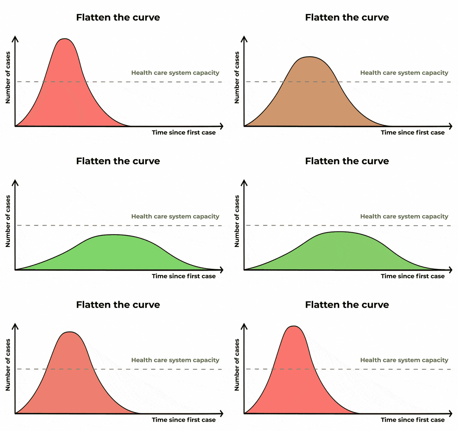 “Flattening the curve” is another way of saying “slowing the spread”. The epidemic is lengthened, but we reduce the number of severe cases, causing less burden on public health systems. The Conversation/CC BY ND
However, social media posts routinely compare COVID-19 figures with those of other causes of death that show:
Even when researchers talk of exponential growth, they can still mislead.
An Israeli professor’s widely-shared analysis claimed COVID-19’s exponential growth “fades after eight weeks”. Well, he was clearly wrong. But why?
His model assumed COVID-19 cases grow exponentially over a number of days, instead of over a succession of transmissions, each of which may take several days. This led him to plot only the erratic growth of the outbreak’s early phase.
Better visualisations truncate those erratic first cases, for instance by starting from the 100th case. Or they use estimates of the number of days it takes for the number of cases to double (about six to seven days).
Read more: The bar necessities: 5 ways to understand coronavirus graphs
3. Not all infections are cases
Then there’s the confusion about COVID-19 infections versus cases. In epidemiological terms, a “case” is a person who is diagnosed with COVID-19, mostly by a positive test result.
But there are many more infections than cases. Some infections don’t show symptoms, some symptoms are so minor people think it’s just a cold, testing is not always available to everyone who needs it, and testing does not pick up all infections.
Infections “cause” cases, testing discovers cases. US President Donald Trump was close to the truth when he said the number of cases in the US was high because of the high rate of testing. But he and others still got it totally wrong.
More testing does not result in more cases, it allows for a more accurate estimate of the true number of cases.
The best strategy, epidemiologically, is not to test less, but to test as widely as possible, minimising the discrepancy between cases and overall infections.
4. We can’t compare deaths with cases from the same date
Estimates vary, but the time between infection and death could be as much as a month. And the variation in time to recovery is even greater. Some people get really ill and take a long time to recover, some show no symptoms.
So deaths recorded on a given date reflect deaths from cases recorded several weeks prior, when the case count may have been less than half the number of current cases.
The rapid case-doubling time and protracted recovery time also create a large discrepancy between counts of active and recovered cases. We’ll only know the true numbers in retrospect.
5. Yes, the data are messy, incomplete and may change
Some social media users get angry when the statistics are adjusted, fuelling conspiracy theories.
But few realise how mammoth, chaotic and complex the task is of tracking statistics on a disease like this.
Countries and even states may count cases and deaths differently. It also takes time to gather the data, meaning retrospective adjustments are made.
We’ll only know the true figures for this pandemic in retrospect. Equally so, early models were not necessarily wrong because the modellers were deceitful, but because they had insufficient data to work from.
Welcome to the world of data management, data cleaning and data modelling, which many armchair statisticians don’t always appreciate. Until now.
Read more: When a virus goes viral: pros and cons to the coronavirus spread on social media
Authors: Jacques Raubenheimer, Senior Research Fellow, Biostatistics, University of Sydney