
In a bad fire year, Australia records over 450,000 hotspots. These maps show where the risks have increased over 20 years
- Written by: Rick McRae, Adjunct Professor, School of Science at UNSW Canberra, UNSW Sydney
The bushfire outlook for many parts of Australia has changed drastically over the past decade. Environmental conditions have transformed, producing larger and more destructive bushfires.
The frequency of bushfires that alter the atmospheric conditions around them has also increased. Nowhere was this more evident than during the Black Summer bushfires of 2019-2020.
As we continue to experience the effects of climate change, these environmental changes and destructive fire events will only become more prevalent.
Thanks to satellite imaging data collected over the past 20 years, we can map and quantify the region-by-region impact of climate change and how this has affected the prevalence of fire in different parts of Australia. With more accurate bushfire modelling, we can assist fire services and land managers to determine where they need to refocus their efforts as we adjust to the long haul of adaptation to climate change.
To this end, the maps in this article show where fires occurred in two consecutive decades, and show the changes between them. They also show regions where those changes exceed a threshold, indicating a significant increase in fire activity. This enables better-targeted fire risk management.
Read more: 200 experts dissected the Black Summer bushfires in unprecedented detail. Here are 6 lessons to heed
Two decades of satellite fire monitoring
More than 20 years ago NASA launched two satellites, (Terra in 1999 and on Aqua in 2002), to monitor the Earth’s surface with specialised sensors. One sensor, MODIS (MODerate resolution Imaging Spectroradiometer), was able to see both smoke plumes and the infrared signature of fires. An algorithm was developed to classify image pixels containing fire, producing a set of “hotspots”.
Both satellites have lasted well beyond their planned mission durations. This is significant for fire managers, who now have two decades of continuous hotspot data.
Mapping Australia’s fire hotspots
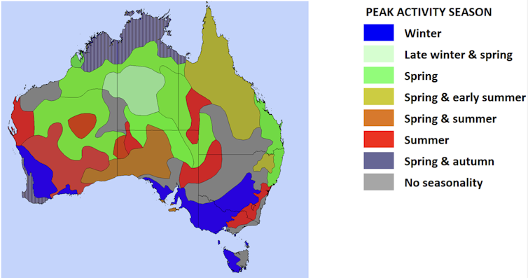
For many years I have been analysing MODIS data from the perspective of seasonality. I have been looking at when fires occurred and whether that reflected expectations. The aim is to validate seasonal bushfire outlooks.
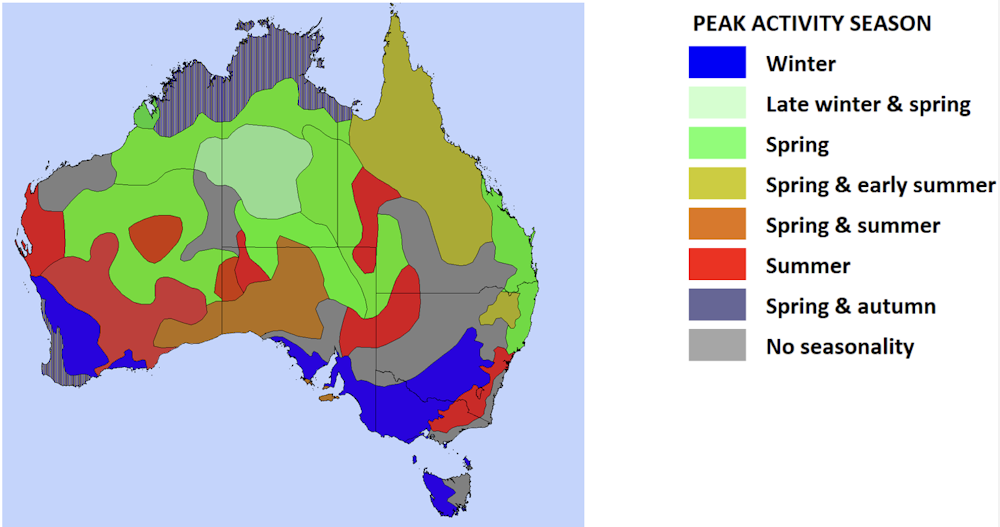
The past 20 years of annual seasonality reviews are now available online. Each year the previous 12 months’ data were compared against those from a set time range or control period. This was a decade-long period covering a mix of El Niño and La Niña years, indicating “average” conditions.
Recently, we passed the end of the second decade of MODIS data. This opened the prospect of comparing two decades (starting in July 2002 and in July 2012) and looking for differences.
 The ratio of hotspots in 2019-20 to the first decade average for zones around Australia.
Author analysis of NASA data, Author provided
The ratio of hotspots in 2019-20 to the first decade average for zones around Australia.
Author analysis of NASA data, Author provided
In a year with a lot of fire, Australia creates more than 450,000 hotspots. This makes the 20 years of MODIS data an irreplaceable tool for seamless, quantitative assessments of fire dynamics across Australia. The datasets are freely available online and have been used to create useful products to assist fire managers.
Several caveats apply to hotspot datasets. Low-intensity fires (especially well-planned, hazard-reduction burns), fires under heavy cloud cover, and fire runs that burn out quickly may not produce a hotspot. The latter was the case for many of the worst fire events during the Black Summer fires.
There is also no way to separate wildfire from planned fire. This has to be a goal, as both contribute to the fire regime but the balance varies a lot between regions. Future burn planning may become a major challenge as big wildfire events like Black Summer put much of the landscape into a single fire age. This makes burning difficult until the forest recovers.
Read more: Fire management in Australia has reached a crossroads and 'business as usual' won’t cut it
To determine how fire activity had changed between the first and second decades of data, hotspots were aggregated into grid-cells. Each spanned half a degree of both latitude and longitude.
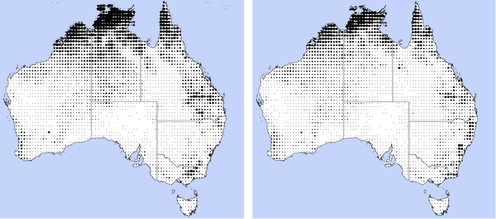 Hotspot count maps for decade one (left) and decade two (right). Larger symbols indicate higher counts.
Author analysis of NASA data, Author provided
Hotspot count maps for decade one (left) and decade two (right). Larger symbols indicate higher counts.
Author analysis of NASA data, Author provided
By comparing the number and ratio of hotspots in the grid-cell count from decade one to that from decade two, we could determine where fire frequency was changing the most.
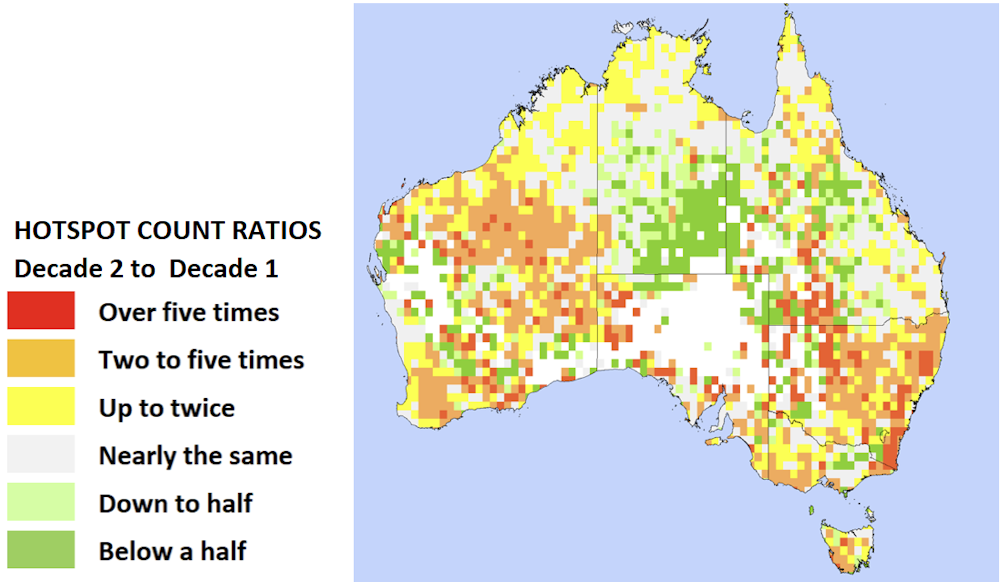 Hotspot count ratios from decade one to decade two, showing where fire activity has increased and decreased.
Author analysis of NASA data, Author provided
Hotspot count ratios from decade one to decade two, showing where fire activity has increased and decreased.
Author analysis of NASA data, Author provided
Some areas, such as eastern New South Wales, have a very high ratio of change between the first and second decade, reflecting Black Summer. Some areas, such as Arnhem Land, have a very high hotspot count and a slight increase from the first decade to the second, which may produce a significant challenge in future.
To encompass the effects of both high counts and high ratios, a threshold was set and any region that exceeded this was an area that needed the most attention.
This produced a set of geographic regions with consistent patterns.
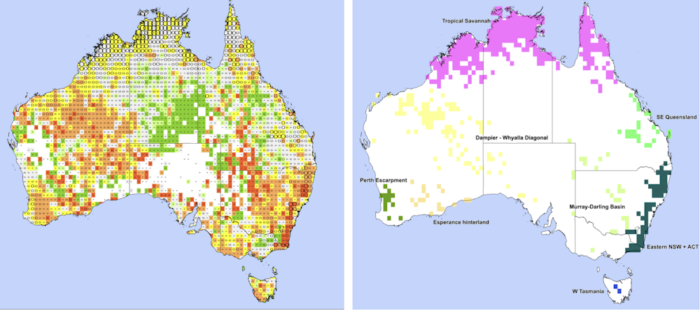 Combinations of decade two hotspot counts and inter-decadal ratios (left) used to create regions of change, coloured separately (right).
Author analysis of NASA data, Author provided
Combinations of decade two hotspot counts and inter-decadal ratios (left) used to create regions of change, coloured separately (right).
Author analysis of NASA data, Author provided
The impacts detailed in the interactive map below (click on the dots for details) must be considered as longer-term management issues for the highlighted regions.
Year-to-year fire patterns have been showing extreme swings in recent years, which may swamp the longer-term trends. However, these trends have picked up many of the key operational challenges, including fire thunderstorms, of recent years.
These challenges are evident in forests in the south-east and south-west of Australia, south-east Queensland, central Tasmania and the tropics.
Read more: Firestorms and flaming tornadoes: how bushfires create their own ferocious weather systems
Hotspot mapping in the future
Challenges as we move forward include developing ways to merge the MODIS data with data from the next generation of satellites, and to separate data for wildfire and prescribed burning.
This and other work will allow us to better anticipate what the next decade will bring.
Authors: Rick McRae, Adjunct Professor, School of Science at UNSW Canberra, UNSW Sydney