

Sick of pie charts for your uni, school or work projects? Here are 5 other options
- Written by: Nicole White, Associate Professor of Statistics, Queensland University of Technology
Whether it’s for a work meeting or a class assignment, presenting data to others is a common task on our to-do list.
We use data to make decisions on our health, finances and the world we live in, yet finding the best ways to communicate data without boring your audience can be daunting.
However, there are some tried and true techniques to getting your message across effectively.
First, you need to boost your data literacy – which includes learning about the different kind of charts and how to use them.
What is data literacy?
Data literacy is the ability to “plot” and present complex data in a way that’s easy to digest. There is even a branch of statistics focusing on the best way to present data.
It’s one of the most desired skills in the workplace, yet a 2020 survey found only one in five employees across nine different countries (including Australia) believe they are data literate.
With seemingly countless options available, choosing the right chart is challenging, and the wrong choice can influence how data is interpreted.
Passing on the humble pie
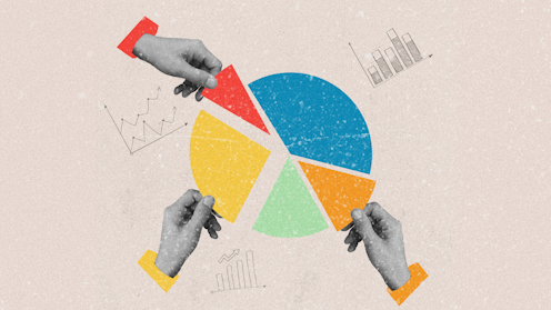
Pie charts are often the first pick when it comes to presenting data with different categories, such as age group or blood type. These categories are represented as slices, with the size of each slice proportional to the amount of data.
Doughnut charts, a close relative of the pie chart, work the same way but are shown with a hole in the middle.
As delicious as they sound, these charts should be consumed in moderation.
Pie charts present data in a circular pattern, making it difficult to make comparisons when there are many groups, or when groups are similar in size. They can also misrepresent data entirely, especially when data add up to over 100%.
Here are some alternatives to pie charts that sound just as tasty, but are easier to digest.
Bar charts
Bar charts summarise data across different categories, but present them next to each other. This makes it easier to compare several categories at once.
Here is an example from the Australian Bureau of Statistics showing the different generations from the last census.
Waffle charts
Waffle charts are a good option for data organised by categories.
They present data in a grid, with each unit representing a fixed number. This is useful for presenting both large and small percentages that are difficult to compare side-by-side.
We can clearly see most people eat meat from the figure.
However, a bar chart would make comparing less common diets difficult. With a waffle chart, we can see 4% of people surveyed are vegan, while 2% are pescetarian.
Histograms
Data often represent different measurements, such as height and weight, or time taken to write an article.
Histograms also present data with bars but, unlike bar charts, are used for data collected as numbers, or numerical data.
This chart type is used to show how a set of numbers are spread out, and can be useful in seeing which numbers occur more often than others.
It’s tempting to simplify data by fitting them into categories, but this can sometimes hide interesting facts.
The example below shows the body mass index (BMI) of a group of people as a bar chart.
It’s easy to lose information when trying to simplify BMI into categories, especially among people who may be obese.
Each category in the bar chart could easily be misunderstood as representing BMI as similar ranges. However, if we look at the histogram, BMI for obese people can be as high as 70.
A doctor using this data would need to take into account that someone with a BMI of 60 may need a different treatment method compared to someone with a BMI of 30.
Line charts and scatterplots
Other chart types for numerical data, such as line charts and scatterplots, allow us to explore how different measurements are related to one another.
Line charts are used to visualise trends over time, such as stock prices and weekly flu cases.
In contrast, scatterplots show how two different measurements collected on the same subject are related.
While scatterplots summarise trends, they sometimes show unusual results that would go unnoticed if measurements were charted separately.
For example, the figure below compares life expectancy and health expenditure in different countries.
If we’re only looking at health expenditure, people from the United States would appear healthier as the US spends the most money on health care per person.
Presenting this information along with life expectancy tells a different story.
Keep it simple and avoid ‘chart junk’
It is always tempting to add more information.
“Chart junk” refers to extra information such as excess labels, 3D effects or even different types of data in the same chart.
This makes them more difficult to read and can distort the data, and is usually a sign your data is too complicated. You’re better off using multiple charts to tell the full story.
As Coco Chanel once said, “simplicity is the keynote of all true elegance”.
Keep these words in mind and choose a chart that keeps it simple without compromising style, content and detail.
Authors: Nicole White, Associate Professor of Statistics, Queensland University of Technology