
5 ways to understand coronavirus graphs
- Written by Mark Sanderson, Professor of Information Retrieval, RMIT University
Wrapping your head around the scale of a global pandemic is not easy, and the volume of stats and data can be bewildering.
What, for instance, are we to make of the fact Australia recorded just 109 new cases in its daily count for April 6? Given this figure peaked at around 400 new cases per day, does this mean the rate of infection is now tapering off?
And what, apart from sadness, are we to make of more gruesome statistics, such as the 969 COVID-19 deaths reported in a single day in Italy on March 27?
Which stats are most useful in making sense of the situation? To help interpret and understand the mountains of COVID-19 data, we’ll look at five commonly used methods, and explain the pros and cons of each.
To illustrate each method, we’ll use Johns Hopkins University data for Italy during the 43 days from February 23 to April 5.
1. Daily increases
Much of the COVID-19 data is presented as a daily count of new confirmed infections for the preceding 24 hours. For example, on April 5, Italy had 4,316 new cases.
Such numbers accurately convey the horrific scale of the pandemic, but are less good at revealing how the situation is evolving. Without knowing the previous daily totals, it is impossible to say whether the trend is up or down. We need a way to put it into context.
2. Bar chart of daily new cases
One way to provide context is with a bar chart, also called a histogram, showing each new daily case count.
The graph below shows the number of new cases in Italy, from February 23 (the first day with over 100 new cases, and which we have labelled day 1), to 4,316 on April 5 (day 43).
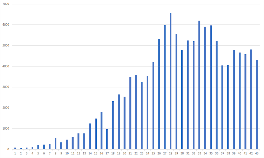 Histogram of daily numbers of new cases.
Johns Hopkins Univ.
Histogram of daily numbers of new cases.
Johns Hopkins Univ.
This type of graph can reveal meaningful trends at a glance. We can see the number of new cases began to stabilise on about day 26, and may even have begun to trend downwards.
But while large trends are obvious, we need to be careful when it comes to smaller trends – they may merely be random variations in the daily counts.
3. Graph of cumulative cases
Daily counts tell us how fast the epidemic is growing, but they don’t tell us how big it has grown overall. For that, we need a graph of the total number of cases so far.
This is called a cumulative graph, because each day’s data point is the sum total of all the previously confirmed cases.
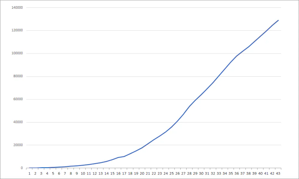 Increase in the total number of people infected with COVID-19 over time.
Johns Hopkins Univ.
Increase in the total number of people infected with COVID-19 over time.
Johns Hopkins Univ.
This is an excellent tool for visualising the full extent of the outbreak so far. But the danger is that it makes things look much worse than they are, because the total number of confirmed cases since the beginning of the outbreak can only go up, not down.
This method also makes it hard to see when growth rates are slowing, because you have to look for a plateau in the curve, rather than a drop.
4. Cumulative cases (log scale)
To compensate, we can present the same data on a logarithmic (or log) scale. This means the graph’s vertical axis (y-axis) is graduated by orders of magnitude (1, 10, 100, 1,000) rather than in equal increments (10, 20, 30, 40).
This basically “squashes” the y-axis so large numbers do not skew the whole graph. If an epidemic is growing exponentially, it arguably makes more sense to plot it this way because the trend line can “keep up” with the numbers instead of shooting off into the stratosphere.
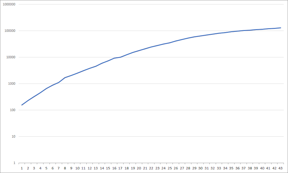 Increase in the total number of people infected with COVID-19 over time with log scale.
Johns Hopkins Univ.
Increase in the total number of people infected with COVID-19 over time with log scale.
Johns Hopkins Univ.
The log scale graph above shows the same data as the previous graph, but now it clearly tells the story of how Italy’s infection rates actually began to slow before day 26.
One downside is that this is clearly a more abstract way of looking at the data, so you need to know how a log scale works before you can make meaningful sense of it.
5. Percentage growth of the total
A less common, although extremely important, way to present the data is to express the daily number of cases as a percentage of the total so far. This is another good way to put the situation in context.
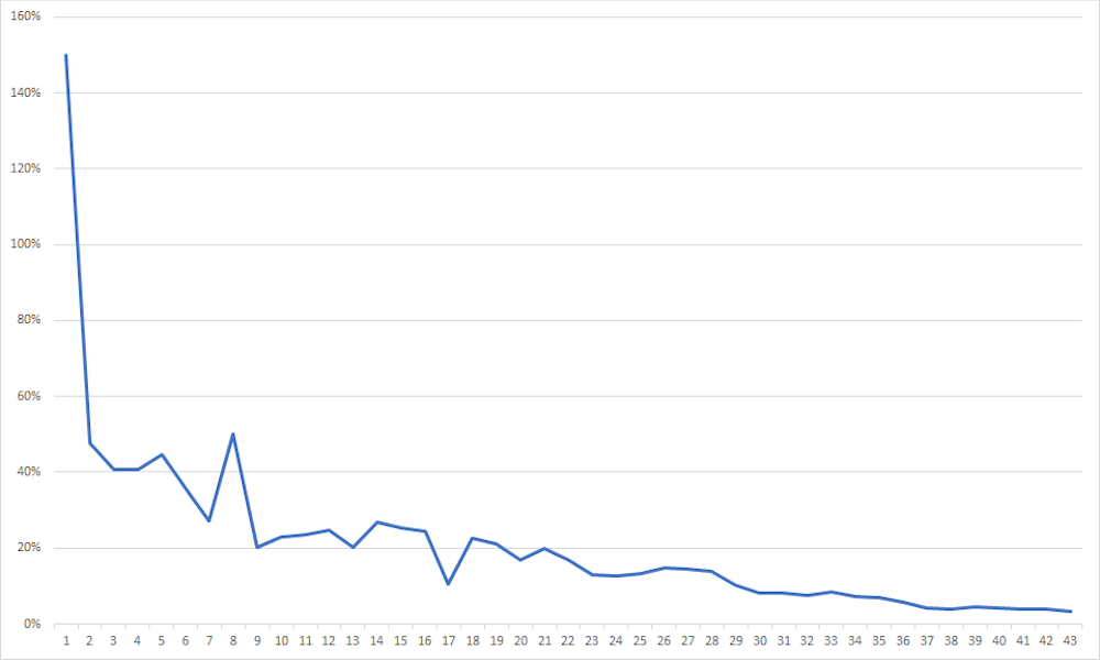 Percentage daily increase in the total number of people infected with COVID-19 over time.
Johns Hopkins Univ.
Percentage daily increase in the total number of people infected with COVID-19 over time.
Johns Hopkins Univ.
Like the log scale graph, the graph above also shows that the daily rate of increase in total cases has dropped steadily over the 43 days.
This method is perhaps the most useful for demonstrating the effectiveness of social distancing and other public health measures for “flattening the curve”.
However, one drawback of using percentages is that this method does not reveal the actual numbers involved. It also risks lulling people into a false sense of security – the percentage graph can trend downwards even though the virus is still widespread, and the risk of resurgence still exists.
There’s no ‘best’ way to present the data
These five different ways of presenting exactly the same data can give five different impressions of the situation.
There is also the question of the wider population context in which these numbers are presented.
Italy now has more than 128,900 confirmed cases, compared with a reported 82,600 in China. Given the differences in population (Italy: 60.4 million, China: over 1.4 billion), that means 1 person in 468 has been infected in Italy, compared with just 1 in 16,949 in China.
In tiny Luxembourg, infections stand at 1 person in 223 – an even higher per capita infection rate than Italy.
Countries can also have large differences between regions. New South Wales, the hardest-hit state in Australia, accounts for 46.5% of the country’s cases, despite having 32% of the population.
Testing times
Another crucial piece of context is the total number of tests conducted. This varies hugely, both between countries and over time. When interpreting data on case numbers, it is important to know what proportion of the population has been tested.
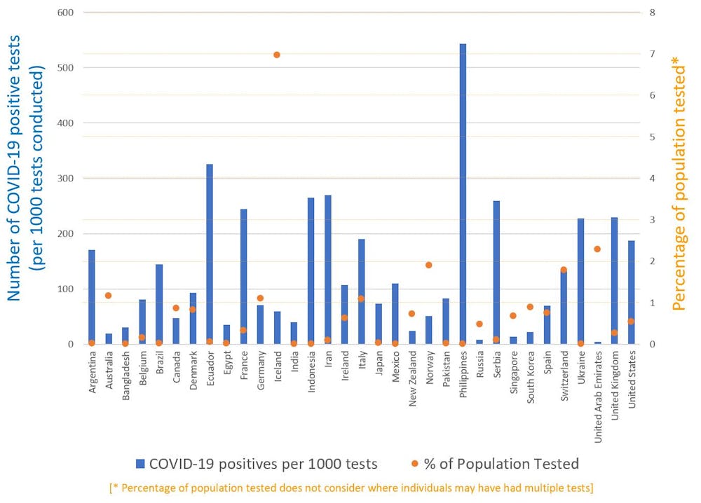 Number of positive COVID-19 tests per 1,000 people (blue) and overall testing rates (orange) for selected countries.
Mark Osborn, Author provided
Number of positive COVID-19 tests per 1,000 people (blue) and overall testing rates (orange) for selected countries.
Mark Osborn, Author provided
Widespread testing also helps to improve estimates of the true fatality rate among those infected with the virus.
Read more: The coronavirus looks less deadly than first reported, but it's definitely not 'just a flu'
As we strive as a society to flatten the curve, it will be heartening to know when our efforts are beginning to bear fruit. The better we understand the data, the easier that will be.
Not only is this important as we all try to come to terms with our new normal, but it will no doubt be crucial in convincing people of the necessity for various restrictions and lifestyle changes as the months drag on.
Authors: Mark Sanderson, Professor of Information Retrieval, RMIT University
Read more https://theconversation.com/the-bar-necessities-5-ways-to-understand-coronavirus-graphs-135537