

GetUp! on the impact of US corporate tax cuts on wages
- Written by: Fabrizio Carmignani, Professor, Griffith Business School, Griffith University
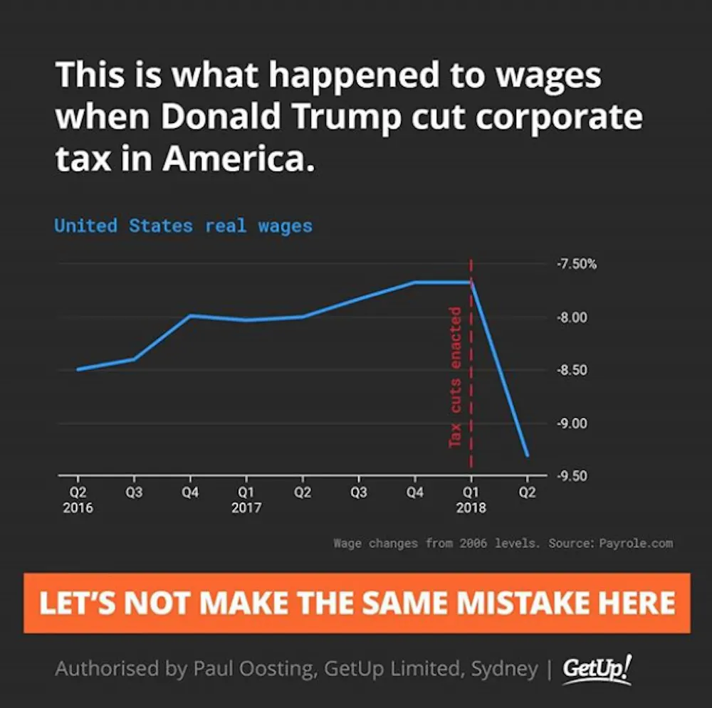 Graph: GetUp! Australia Instagram post, July 2018.
Graph: GetUp! Australia, Instagram
Graph: GetUp! Australia Instagram post, July 2018.
Graph: GetUp! Australia, Instagram
Graph shared by GetUp! Australia on Facebook and Instagram, July 2018
Debate continues over the Turnbull government’s proposal to cut the corporate tax rate from 30% to 25% for businesses with turnover of more than A$50 million.
One major point of contention is the possible effect of the tax cuts on Australian wages.
A social media post shared by lobby group GetUp! Australia argued against the tax cuts, suggesting that US real wages fell after the Trump administration cut corporate tax rates from 35% to 21%.
Let’s take a closer look.
Checking the source
The Conversation requested sources and comment from GetUp! to support the data used in the graph, and the suggestion that there had been a causal relationship between the enactment of corporate tax cuts in the US and a reduction in real wages.
We first found the graph in Bloomberg in this article by economics blogger and former Assistant Professor of Finance at Stony Brook University, Noah Smith.
The underlying data comes from the Payscale Real Wage Index – adjusted for inflation. We noted that percentage change since 2006 is an unorthodox Y axis for a wages graph, but that’s what the Payscale Index tracks.
We added the marker of the corporate tax rate being cut in the United States, which while passed in Q4 [the fourth quarter] of 2017, came into effect in Q1 [the first quarter] of 2018.
Note that in the Instagram image, we attributed Payrole.com as the source, instead of Payscale.com. This was a drafting error on our part.
Proponents of corporate tax cuts both in the US and Australia have asserted that there is a causal relationship between a lower corporate tax rate and higher wages (see US example and Australian example). The graph we posted in Instagram demonstrates that, in the US experience, that has not been the case.
This suggests that there is no causal relationship between a lower corporate tax rate and higher wages, and that cutting the corporate tax rate based on an expected flow on effect to wages would be a mistake.
Verdict
The social media post shared by GetUp! Australia, which could be read by many as suggesting that US corporate tax cuts caused wages to fall, is problematic and potentially misleading for two reasons.
Firstly: charts constructed with data from the US Bureau of Labor Statistics suggest that the chart used by GetUp! overestimates the drop in wage growth in the US between the first and second quarters of 2018.
According to the Bureau of Labor Statistics data, wage growth over that period declined slightly (rather than significantly), or was moderately positive, depending on the measure used.
Secondly, and most importantly: the chart used by GetUp! can’t conclusively establish any causal relationship between the enactment of US corporate tax cuts in January 2018 and any drop in wage growth.
While the chart does not support the argument that corporate tax cuts cause higher wages, it also cannot conclusively reject it.
What does the GetUp! chart show and suggest?
The social media post shared by GetUp! has the title: “This is what happened to wages when Donald Trump cut corporate tax in America.”
It shows a line chart with the heading: “United States real wages.” The reference to “real wages” means the index has been adjusted for inflation. A note below the chart says the wage changes are relative to 2006 levels.
The line chart depicts US real wages rising from minus 8.50% of 2006 levels in Q2 2016, to minus 7.70% in Q1 2018. A vertical line marks the point in Q1 2018 when the tax cuts were enacted. The line then shows a drop to minus 9.30% of 2006 levels in Q2 2018.
A reader could quite easily interpret the chart as meaning the enactment of corporate tax cuts in the US had an immediate and negative effect on real wage growth.
The subtitle reads: “Let’s not make the same mistake here.”
Are the data used in the chart appropriate?
As noted by GetUp! in their response to The Conversation, the source for the data used in the chart is Payscale, not payrole.com, as stated in the post.
Payscale is a US commercial company that provides information about salaries. The company publishes a quarterly wage index based on its own data, which it says is based on more than 300,000 employee profiles in each quarter, capturing the total cash compensation of full time employees in private industry and education professionals in the US.
Given the commercial nature of Payscale data, I don’t have access to their primary dataset, and can only rely on the description of the methodology reported on their website. I have no reason to doubt the validity of the data and/or the methodology.
I do, however, suggest that presenting the data in the form of percentage changes from 2006 is not ideal for an assessment of wage dynamics around the time of the enactment of corporate tax cuts.
In their response to The Conversation, GetUp! did acknowledge that “percentage change since 2006 is an unorthodox Y axis for a wages graph”.
It would be more informative to present the data as percentage changes between one quarter and the same quarter of the previous year, or between two consecutive quarters. I have done this in the two charts below, using the data publicly available from Payscale.
The story is qualitatively similar to that shown in the chart presented by GetUp!. Therefore, we can say that – based on the Payscale data – real wages seem to have dropped between the first and second quarters of 2018.
Is Payscale the best source for this kind of analysis?
While there is no reason to believe that the Payscale data are incorrect, it is worth considering a more standard statistical source.
Earnings data for the US are available from a variety of institutions. The difficulty, in this case, is that there are many different statistical definitions of earnings and wages depending on which sectors, geographical areas, and types of employees are observed.
One of the most commonly used definitions is the “average hourly earnings of production and non-supervisory employees on private payrolls”, with monthly data supplied by the US Bureau of Labor Statistics.
Using these data, I have recomputed changes in real wages (adjusted for inflation) between one quarter to the same quarter of the previous year and between two consecutive quarters.
These two charts based on US Bureau of Labor Statistics data tell a different story from the charts based on the Payscale data.
In particular, the change in wages between the first and second quarters of 2018 is moderately positive (+0.4%) rather than significantly negative (minus 1.7% based on the Payscale data).
The drop in wages between the second quarter of 2017 and the second quarter of 2018 is also less sharp (minus 0.11%, compared to minus 1.4% from the Payscale data).
These differences may be determined by the different coverage and/or statistical definitions used by Payscale and the US Bureau of Labor Statistics to measure wages and compensation.
The story the GetUp! chart suggests: is it correct?
The combination of the words and the image could suggest to some that there was a causal relationship between the enactment of corporate tax cuts and a drop in real wages in the US.
But the chart used in the post isn’t suited to provide any evidence on causality.
That’s because changes in real wages can be determined by a variety of economic factors, such as changes in the makeup of the labour force and business cycle fluctuations. A chart like the one published by GetUp! can’t possibly isolate the impact of just one factor.
The observation that wage growth dropped around the time of the enactment of the corporate tax cuts doesn’t automatically imply that this drop was caused by the tax cuts. At best, a correlation between the two events can be established, not a causal effect.
We also need to keep in mind that the relationship between tax cuts and wages is likely to involve time lags. The effect of corporate tax cuts on wages, or any other economic variable, takes time to feed through the economic system and to show up in the data. This reinforces the argument that the chart demonstrates correlation, rather than causality.
Having said that, while the data used cannot provide evidence for the argument that corporate tax cuts lead to lower wages, it cannot conclusively reject the argument, either. – Fabrizio Carmignani
Blind review
The GetUp! chart is captioned: “This is what happened when Donald Trump cut corporate tax in America.” Strictly speaking, GetUp! don’t actually claim that the corporate tax cut caused the wage to fall, but it is certainly what the reader is led to believe.
The author has identified the key problem with the GetUp! chart, which is that there is no evidence that the fall in real wages was caused by the enactment of corporate tax cuts. In fact, the chart provides no evidence to either support or reject the premise that a corporate tax cut would have any effect on wages.
The alternative data sourced by the author from the US Bureau of Labor Statistics cast some doubt on the accuracy of the data used by GetUp!, yet this is a distraction from the main argument that neither chart proves causality between corporate tax cuts and wage growth.
As the author says, there are many factors that influence real wage growth. Some examples include changes in the skills and experience of the working population, changes in government expenditure, and of course, changes to tax policy. It would be a mistake to attribute the recent decline in US wages to any single factor, such as the cut to the corporate tax rate.
This is why economic modelling is so powerful. In a “laboratory”, economic modellers can build two versions of the world: one with a tax cut and one without. With all other things held equal, the only differences between these two worlds must be a consequence of the tax cut.
Economic modelling produced by Victoria University’s Centre of Policy Studies (and of which I was an author) finds that despite stimulating growth in pre-tax real wages, a company tax cut would cause a fall in the average incomes of the Australian population.
So while this FactCheck shows that the wage chart from GetUp! is inconclusive, my view (based on the Victoria University modelling) is that company tax cuts could be a “mistake” where wages are concerned. – Janine Dixon
 The Conversation FactCheck is accredited by the International Fact-Checking Network.
The Conversation’s FactCheck unit was the first fact-checking team in Australia and one of the first worldwide to be accredited by the International Fact-Checking Network, an alliance of fact-checkers hosted at the Poynter Institute in the US. Read more here.
Have you seen a “fact” worth checking? The Conversation’s FactCheck asks academic experts to test claims and see how true they are. We then ask a second academic to review an anonymous copy of the article. You can request a check at checkit@theconversation.edu.au. Please include the statement you would like us to check, the date it was made, and a link if possible.
Authors: Fabrizio Carmignani, Professor, Griffith Business School, Griffith University
Read more http://theconversation.com/factcheck-getup-on-the-impact-of-us-corporate-tax-cuts-on-wages-100753