how crime books embraced lurid green
- Written by Carolyn McKay, Senior Lecturer – Criminal Law, Procedure, Digital Criminology, University of Sydney
Green is a colour that evokes nature, fecundity, sustainability.
At the traffic lights it signals go; on a boat, starboard.
It’s a soft celadon glaze; an intense Van Eyck wedding dress; frothy, aromatic matcha tea; aurora borealis; a meditative praying mantis. It’s jungle camouflage, Joyce’s snotgreen sea, green mould and Martians.
If green had a smell, would it be freshly cut grass – or bile-infused Exorcist vomit?
Green, like all colours, has innumerable meanings and cultural associations. My interest in green stems from the books I curated in Lurid: Crime Paperbacks and Pulp Fiction.
My favourite books in Lurid are the green Penguin crime series from the 1960s. Penguin was founded by Allen Lane in 1935 and revolutionised publishing through a focus on well-designed, pocket-sized and affordable high-quality literature, as distinct from mere pulp.
Read more: Friday essay: the complex, contradictory pleasures of pulp fiction
The covers were standardised yet stylish and instantly recognisable: two horizontal bands of colour separated by a central white band featuring the author’s name and title in Gill Sans font. Initially designed by Edward Young, the aesthetic was strengthened in 1947 by German typographer Jan Tschichold’s Penguin Composition Rules.
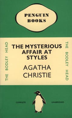 The cheerful Penguin logo, also designed by Young, was the only pictorial element on these early covers. In Jeremy Lewis’s Penguin Special, he writes Penguin eschewed the lurid picture jackets – “breastsellers” – adopted in the US in favour of English restraint and text-only designs.
The books were colour-coded by subject: the now classic orange for fiction, dark blue for biographies, red for drama. Of the first ten Penguin books published, two were crime and colour-coded green.
Since curating the Lurid exhibition, I’ve been wondering: why green? Why not blood-spatter red or noir black?
The affect of green
As a visual artist as well as a visual criminologist, I have a great interest in colour and its affective qualities.
The initial green used on Penguin crime covers was a slightly earthy green, not unlike terre verte. This is a soft green pigment traditionally used as a cool element when mixing flesh tones in a limited palette of flake white, yellow ochre, Venetian red and ivory black, depending on the subject’s skin tones.
Terre verte is often used as a grisaille or underpainting in figurative works and portraiture. But there are so many other irresistible greens in oil painting: cobalt, emerald, viridian, phthalo, cadmium, sap, olive, chromium.
The cheerful Penguin logo, also designed by Young, was the only pictorial element on these early covers. In Jeremy Lewis’s Penguin Special, he writes Penguin eschewed the lurid picture jackets – “breastsellers” – adopted in the US in favour of English restraint and text-only designs.
The books were colour-coded by subject: the now classic orange for fiction, dark blue for biographies, red for drama. Of the first ten Penguin books published, two were crime and colour-coded green.
Since curating the Lurid exhibition, I’ve been wondering: why green? Why not blood-spatter red or noir black?
The affect of green
As a visual artist as well as a visual criminologist, I have a great interest in colour and its affective qualities.
The initial green used on Penguin crime covers was a slightly earthy green, not unlike terre verte. This is a soft green pigment traditionally used as a cool element when mixing flesh tones in a limited palette of flake white, yellow ochre, Venetian red and ivory black, depending on the subject’s skin tones.
Terre verte is often used as a grisaille or underpainting in figurative works and portraiture. But there are so many other irresistible greens in oil painting: cobalt, emerald, viridian, phthalo, cadmium, sap, olive, chromium.
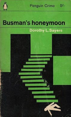 The original earthen green hue of Penguin crime was brightened in the 1960s when Italian art director Germano Facetti challenged the traditional Penguin design rules and hired Polish graphic designer Romek Marber to revitalise the book covers.
The “Marber Grid” and pictorial covers placed the typography and Penguin logo in the top third of the cover and allowed two-thirds of the layout for striking modernist illustration and graphic design.
The covers of Dorothy L. Sayers’ Busman’s Honeymoon and Lord Peter Views the Body show the distinctive and recurrent white stick figure Marber applied only to her books.
The Busman’s Honeymoon, in particular, shows Marber at his best. The geometric design evokes a staircase with a corpse – the identifying device of the white cut-out – at the bottom.
The original earthen green hue of Penguin crime was brightened in the 1960s when Italian art director Germano Facetti challenged the traditional Penguin design rules and hired Polish graphic designer Romek Marber to revitalise the book covers.
The “Marber Grid” and pictorial covers placed the typography and Penguin logo in the top third of the cover and allowed two-thirds of the layout for striking modernist illustration and graphic design.
The covers of Dorothy L. Sayers’ Busman’s Honeymoon and Lord Peter Views the Body show the distinctive and recurrent white stick figure Marber applied only to her books.
The Busman’s Honeymoon, in particular, shows Marber at his best. The geometric design evokes a staircase with a corpse – the identifying device of the white cut-out – at the bottom.
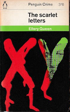
 Marber’s last Penguin crime cover design was for Ellery Queen’s The Scarlet Letters in 1965. With the letters X and Y that, in the novel, a dying man traces in his own blood, the design introduces trickles of red, photography and a solid black background.
Looking at these book covers today, there is power in the simplicity of these designs with their limited colour palette, elements of photomontage, collage, drawing and geometric pattern, and use of sans serif font.
And, of course, there is the bright green.
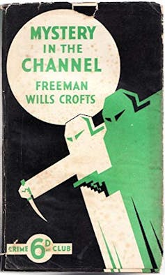
The Penguin crime series is not the only one to feature green. Launched by Collins in the 1930s, the White Circle Crime Club used a bold graphic design featuring two menacing figures and variations on a restricted palette of green, black and white.
This green branding was an intentional strategy to compete directly with the green Penguins.
Green to kill
Why green? Perhaps the answer lies in green’s association with toxicity.
The 18th century’s Scheele’s green, derived from arsenic, was vivid and alluring. The 19th century’s emerald green was highly desirable, and used extensively in clothing and wallpaper, including that of William Morris. Unfortunately, it was horribly poisonous: arsenic fumes from Emerald Green wallpaper killed.
Read more:
How we discovered three poisonous books in our university library
Green, then, is deadly. Green radioluminescent paint shone brightly on watches and caused radium poisoning; green chlorine gas was first used as a chemical weapon in the first world war.
The green of absinthe’s la fée verte, the green fairy, is intoxicating, once thought to be hallucinogenic, and an ingredient in Ernest Hemingway’s Death in the Afternoon cocktail.
With these lethal associations the green of crime fiction starts to make sense.
Sometimes, you can judge a book by its cover.
Marber’s last Penguin crime cover design was for Ellery Queen’s The Scarlet Letters in 1965. With the letters X and Y that, in the novel, a dying man traces in his own blood, the design introduces trickles of red, photography and a solid black background.
Looking at these book covers today, there is power in the simplicity of these designs with their limited colour palette, elements of photomontage, collage, drawing and geometric pattern, and use of sans serif font.
And, of course, there is the bright green.
The Penguin crime series is not the only one to feature green. Launched by Collins in the 1930s, the White Circle Crime Club used a bold graphic design featuring two menacing figures and variations on a restricted palette of green, black and white.
This green branding was an intentional strategy to compete directly with the green Penguins.
Green to kill
Why green? Perhaps the answer lies in green’s association with toxicity.
The 18th century’s Scheele’s green, derived from arsenic, was vivid and alluring. The 19th century’s emerald green was highly desirable, and used extensively in clothing and wallpaper, including that of William Morris. Unfortunately, it was horribly poisonous: arsenic fumes from Emerald Green wallpaper killed.
Read more:
How we discovered three poisonous books in our university library
Green, then, is deadly. Green radioluminescent paint shone brightly on watches and caused radium poisoning; green chlorine gas was first used as a chemical weapon in the first world war.
The green of absinthe’s la fée verte, the green fairy, is intoxicating, once thought to be hallucinogenic, and an ingredient in Ernest Hemingway’s Death in the Afternoon cocktail.
With these lethal associations the green of crime fiction starts to make sense.
Sometimes, you can judge a book by its cover.
Authors: Carolyn McKay, Senior Lecturer – Criminal Law, Procedure, Digital Criminology, University of Sydney