6 Design and Branding Principles for Winning Ute Wraps
- Written by Brian Dwyer
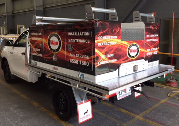
These days, ute (utility vehicle) trays provide an excellent space for advertising and boosting brand recognition. With the right ute signage design, your company will surely have a better chance of becoming a household name.
There are many different ways that ute wraps can add value to your business. These serve as a moving advertisement to help build your brand identity. These can also assist in giving your brand a better recall, providing you with a cost-effective way of spending your marketing funds. And since they are sturdy, these wraps also help protect the vehicle, especially when they are made using vinyl.
To help you make the most out of these benefits, below are six principles you should think about when designing a winning ute wrap:
Take Note of the Vehicle’s Body Lines and Custom Features
Before you can start designing the ute wrap, you must first get familiar with the available space you will be using. This means you need to measure the dimensions of the vehicle.
Taking pictures would also help you become familiar with the area you will be using for your design. But, when doing so, remember to only take direct photographs from all sides – never from an angle.
You must also gather measurements of any extreme curves the vehicle has as well as the door handles, body breaks, rivets, and other similar parts. As the ute wrap designer, you must know of any customised features that are not standard to the make and model of the vehicle where the wrap would be used in.
This will allow you to work within the given space and avoid going over the actual area set aside for the wrap. Not getting familiar with your “canvas” might result in an incomplete implementation of the design. It will also ensure that all the unique features of the vehicle would be accommodated in the custom-made ute wrap.
Avoid Running Text from the Car’s Side to the Bonnet
This is probably one of the most common rookie mistakes in designing a ute wrap. Running text from the car’s side to the bonnet can cause a big difference between the digital on-screen design and the actual result.
Not only is it extra challenging to make the text meet, but it is also more labour-intensive. Of course, it is not impossible, but the result might not be as appealing in terms of visual impact, especially when viewed at multiple angles.
KISS: “Keep It Short and Sweet”
When creating a design for a vehicle wrap, you must remember to avoid giving too much information. Remember the acronym KISS: Keep it short and sweet.
Keeping the message simple will ensure that the target audience can read and understand it clearly, even with the vehicle travelling at more than 60 kilometres per hour. Some examples of the basic information you can include in your vehicle wrap are:
-
The name of the company or brand
-
Its logo or any identifying symbol that can help people know what the business is all about
-
One or two types of contact information (i.e., website, email address, or contact information)
One example is the ute wrap design used by a company called Mosquito Authority. The vehicle wrap features the company name as its most prominent aspect (with an image of a mosquito inside the first letter “o” in “Mosquito”). The wrap immediately tells potential customers that the company is an exterminator, and it can be contacted in two ways (a website and phone number are included).
Clarity is Everything
Although simple is good for designing a vehicle wrap, you must still make sure that the message is clear. After all, what use is the promotional material if people don’t understand what it means?
Aside from introducing a brand, you must also make sure that the ute wrap design tells the audience what the company offers. Some trade or brand names don’t directly express the type of products or services they offer. In this case, it is wise to add some keywords to clarify what the business is all about.
For example, if a dental clinic is named after the dentists who founded it, it is unlikely that the words “teeth” or “dental” will be included in the brand name. To clarify the message, you can add a brief list of services offered in the wrap design, such as “braces,” “wisdom teeth,” and “extractions.”
Aside from keywords, adding images and graphics can also help clarify your ute wrap’s message. For instance, incorporating images of blue bubbles and swirls into a truck wrap can help tell potential customers that a company offers water delivery.
Remember: Make it short, simple, and clear. People should be able to tell the company’s identity and offerings with just one glance.
Be Bold to Pique Interest
Vehicle wraps offer the perfect opportunity to go big and bold. Since the medium will most likely be moving when people see it, it is best to create a more attention-grabbing design. In this case, make the message as obvious as possible that drivers and pedestrians would only need a second to digest it.
Plus, big and bold designs ensure that the car signage can be clearly seen even from afar. Remember: Oversized designs are great for encouraging better recall.
When choosing a font for your design, make sure that you pick a legible one that requires less effort to decipher. While it is okay to add hand lettering to add excitement or a personal touch to the design, the conventional bold typeface will make sure that the text can be read easily.
Bright Colours Catch Attention
Since colour is one of the most vital elements of design, you must make sure that you know how to use it in your vehicle wrap. Choose the right hue that will arouse emotions related to the brand identity of the company.
For example, red is a popular choice for brands that built an identity filled with energy, love, or passion. Yellow, on the other hand, evokes optimism, clarity and warmth. With blue, it’s all about dependability, strength, and trust.
Aside from that, you should also pick a design colour with respect to:
-
The brand’s message
-
Its expected impact on viewers
-
How it can be seen from a distance
Bright colours are your best bet for vehicle wraps since they can be easily seen even from a distance. They also offer a clear and unobstructed view of the brand’s message, especially when used with texts and graphics with a contrasting hue.
Design for Clarity, Simplicity, and Interest
Before you get a car signage quote, make sure that you fully understand what ute wraps are and how to make them work for your business. Set your sights on accomplishing three goals for the design: clarity, simplicity, and interest. The principles listed in this article should be able to guide you in the process.
AUTHOR BIO
Brian Dwyer is the Director and owner of Colour Source Signwriters, a graphic production business specializing in various vehicle wraps, fleet signs and building signs. The company has been producing professional signage that captures the attention and matches the vision of delighted clients all over Australia since 1990.


